
In today’s digital landscape, a robust mobile-first design is not just a trend; it’s a fundamental pillar of any successful business strategy, especially for small businesses. With the vast majority of online interactions now occurring on smartphones and tablets, prioritizing the mobile user experience is paramount for growth, visibility, and conversion rates.
This comprehensive guide will delve into what mobile-first design entails, why it’s indispensable for small businesses, and how to effectively implement this powerful approach to enhance your online presence and achieve your business objectives. We’ll explore market data, core strategies, and practical applications, providing a clear roadmap for small business owners and solopreneurs.
What is Mobile-First Design?
Mobile-first design is an approach to web development that prioritizes the creation of a website for mobile devices before adapting it for larger screens like desktops. This methodology ensures that the core functionality, content, and user experience are optimized for the most constrained environment first, leading to a more focused and efficient design.

Defining the Mobile-First Approach
The concept, popularized by Luke Wroblewski, emphasizes starting with the smallest screen and progressively enhancing the design for larger viewports. This contrasts sharply with traditional “desktop-first” design, where a desktop site is scaled down for mobile, often resulting in a cluttered or compromised mobile experience. According to The Interaction Design Foundation, designing for mobile first forces designers to focus on essential content and functionality, making tough choices about what truly matters to users and the business.
Key Characteristics of Mobile-First Design
- Content Prioritization: Focuses on displaying only the most critical information and calls-to-action (CTAs) on smaller screens.
- Performance Optimization: Emphasizes fast loading times and efficient resource usage, crucial for mobile networks.
- Touch-Friendly Interfaces: Designs with larger buttons, ample spacing, and intuitive navigation for touch interactions.
- Progressive Enhancement: Builds a solid mobile foundation and then adds more complex features or richer content for larger screens.
Why This Approach Matters
For small businesses, this approach is vital because it addresses the reality of how most customers interact with their brands online. A website built with mobile-first principles is inherently more user-friendly on all devices, leading to better engagement, lower bounce rates, and improved conversion rates. It’s a proactive business strategy that aligns with current user behavior and future digital trends.
Why Mobile-First is Critical for SMBs
The shift to mobile-first design is not merely a technical preference; it’s a strategic imperative for small businesses aiming for sustainable growth and competitive advantage. Ignoring mobile optimization can lead to significant losses in traffic, customer engagement, and revenue.

Meeting Customer Expectations
Today’s consumers expect seamless digital experiences across all devices. Research shows that 88.5% of mobile users say slow loading times are their top reason for leaving a site, and 61% will go to another site if a mobile experience is poor. For a small business, this means every second counts, and a clunky mobile site can directly translate to lost opportunities.
Consider these critical user behaviors:
- Instant Gratification: Mobile users are often on the go and need quick access to information or services.
- Device Dependence: Many users rely solely on their mobile devices for internet access, especially in emerging markets.
- Social Media Integration: With 99% of social media users accessing platforms via mobile devices, a mobile-optimized site is crucial for converting social media traffic.
SEO Advantages and Google’s Stance
Google has officially adopted mobile-first indexing, meaning the mobile version of your website is the primary one Google uses for crawling, indexing, and ranking. If your site isn’t mobile-friendly, it’s less likely to rank well in search results, directly impacting your online visibility. This makes mobile-first a non-negotiable component of any effective business strategy for online presence.
Key SEO benefits include:
- Improved Rankings: Mobile-friendly sites are favored in search results, especially for mobile searches.
- Enhanced User Experience Signals: Lower bounce rates and longer dwell times on mobile-optimized sites send positive signals to search engines.
- Better Indexing: Google’s crawlers can more effectively understand and index content designed for mobile.
Market Data & Business Impact
The statistics overwhelmingly support the necessity of mobile-first design for small businesses. The digital landscape is dominated by mobile usage, and these trends are only accelerating, making a strong mobile presence a cornerstone of a forward-thinking business strategy.

Dominance of Mobile Usage
The sheer volume of mobile users and transactions underscores its importance. By 2025, there will be an estimated 7.33 billion mobile users worldwide. This massive audience primarily interacts with the web through their phones, influencing everything from e-commerce to local searches.
Consider the following market indicators:
- Global Mobile Users: Projected to reach 7.33 billion by 2025, highlighting the vast mobile audience.
- Mobile E-commerce Sales: Expected to hit $2.52 trillion in 2024, demonstrating the financial power of mobile transactions.
- Mobile Web Traffic: Over half of all global web traffic now comes from mobile devices, a share that continues to grow.
Direct Impact on Business Metrics
Mobile-first design directly correlates with improved business outcomes. Websites optimized for mobile see significantly better performance across key metrics, from conversions to customer loyalty.
Here’s a snapshot of the impact:
| Metric | 2024–2025 Statistic |
|---|---|
| Global mobile users | 7.33 billion by 2025 |
| Mobile e-commerce sales | $2.52 trillion (2024) |
| Social media mobile access | 99% |
| Conversion rate boost | +40% (mobile-optimized vs. not) |
| Bounce rate (non-optimized) | 60% |
| Site abandonment (slow load) | 88.5% |
| Won’t recommend poor site | 57% |
| Will leave for better site | 61% |
These figures clearly indicate that a mobile-first approach is not just beneficial but essential for capturing and retaining the modern customer, directly influencing a small business’s bottom line.
Core Principles & Best Practices
Adopting a mobile-first business strategy involves adhering to several core principles and best practices that guide the design and development process. These principles ensure that the resulting website is not only functional but also provides an exceptional user experience on mobile devices.
Prioritizing Content and Functionality
The essence of mobile-first is ruthless prioritization. What is absolutely essential for your mobile users? This question should drive all design decisions. As highlighted by Figma’s resource library, you must identify your core business goals and the user actions that support them.
- Identify Core CTAs: What actions do you want users to take immediately (e.g., “Call Now,” “Get a Quote,” “Order Online”)? Make these prominent.
- Streamline Navigation: Mobile navigation should be simple, intuitive, and easy to access, often using a hamburger menu or clear tab bar.
- Essential Information First: Place crucial business information (contact details, operating hours, location) at the top of the page.
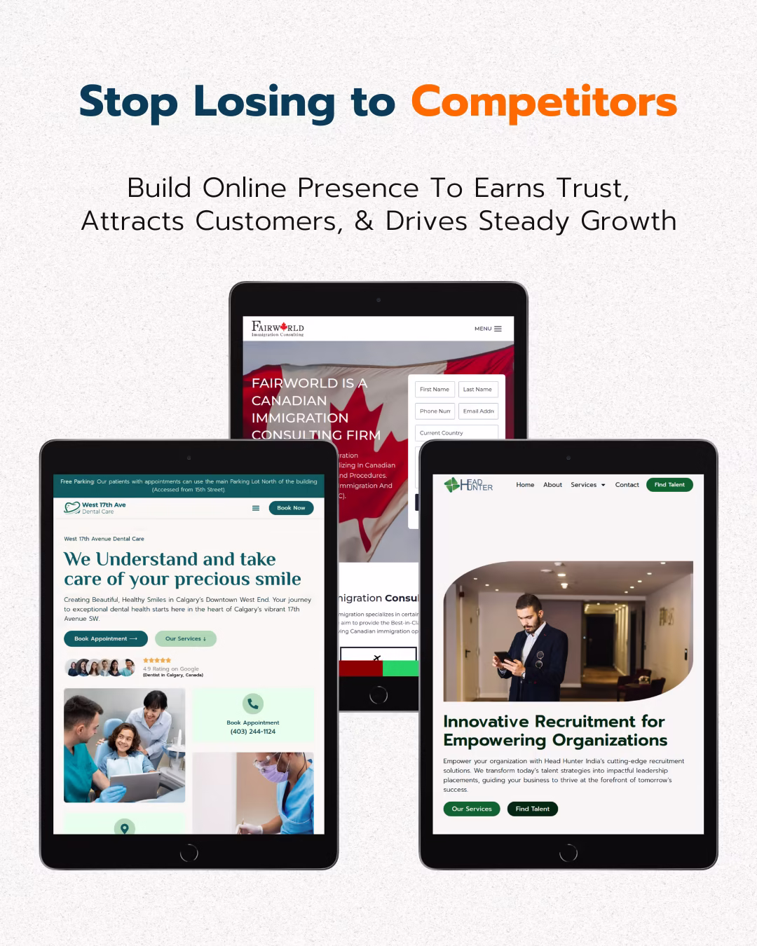
For example, Puffin Packaging’s mobile site leads with a “Get a Quote” button, making it easy for users to convert, while Yang’s Place prominently displays menu and online order options for enhanced conversion.
Performance Optimization Techniques
Mobile users often contend with slower network speeds and limited data plans. Therefore, optimizing for speed is a critical business strategy for mobile-first design. Fast loading times reduce bounce rates and improve user satisfaction.
- Optimize Images: Compress images without sacrificing quality and use responsive image techniques (e.g., `srcset`).
- Minimize Code: Reduce JavaScript, CSS, and HTML file sizes through minification and concatenation.
- Leverage Browser Caching: Store static assets locally on the user’s device to speed up subsequent visits.
- Use a Content Delivery Network (CDN): Distribute your content across multiple servers globally to deliver it faster to users based on their geographic location.
Flipkart’s success in mobile transactions is largely attributed to its focus on fast load times and simplified navigation, proving the direct correlation between speed and revenue.
Designing for Touch and Readability
Mobile interfaces are primarily touch-based, requiring different design considerations than mouse-driven desktop experiences. Readability on smaller screens is also paramount.
- Large Touch Targets: Ensure buttons and interactive elements are large enough for fingers to tap easily without accidental clicks.
- Ample White Space: Provide sufficient spacing between elements to prevent a cluttered look and improve readability.
- Legible Typography: Use clear, readable fonts with appropriate sizing and line spacing for mobile screens.
- Clear Visual Hierarchy: Guide the user’s eye to the most important information using size, color, and placement.
Companies like Airbnb and Spotify are excellent examples of mobile-first design, featuring large, clearly labeled buttons and intuitive navigation that enhance the user experience and reduce friction.
Implementing a Mobile-First Business Strategy
For small businesses, implementing a mobile-first business strategy doesn’t have to be an overwhelming task. It involves a systematic approach, starting with understanding your audience and building up your design incrementally.

Actionable Steps for Small Businesses
A structured approach ensures that resources are used efficiently and the final product meets both user needs and business objectives. These steps form a practical business strategy guide for mobile optimization.
- Research Your Mobile Audience: Use analytics tools (like Google Analytics) to understand how users currently interact with your site on mobile devices. What pages do they visit? What are their common tasks? Where do they drop off?
- Start with Mobile Wireframes and Prototypes: Begin your design process by sketching and prototyping for smartphone screens. Focus on the layout, content hierarchy, and user flow for the smallest viewport first. This forces you to prioritize.
- Focus on Core Tasks: Identify the 2-3 most important actions you want users to take on your mobile site (e.g., “Book an Appointment,” “Browse Products,” “Contact Us”). Design the mobile experience around making these tasks as easy as possible.
- Implement Progressive Enhancement: Build a solid, functional mobile experience first. Then, progressively add features, richer content, and more complex layouts for larger screens (tablets, desktops). This ensures a consistent and performant experience across all devices.
- Test Extensively: Use tools like Google’s Mobile-Friendly Test and conduct user testing with real mobile users. Gather feedback and iterate on your design to refine the experience. Test on various devices and network conditions.
Tools and Resources for SMBs
Several tools and platforms can assist small businesses in adopting a mobile-first approach without requiring extensive coding knowledge. These solutions can be crucial for an effective business strategy.
- Website Builders: Platforms like Wix (which holds 45% of the website builder market) and Squarespace offer responsive templates that are inherently mobile-friendly.
- CMS Platforms: WordPress with responsive themes and page builders (e.g., Elementor, Beaver Builder) allows for mobile-first design customization.
- Testing Tools: Google Search Console’s Mobile Usability report, BrowserStack for cross-browser/device testing, and Lighthouse for performance audits.
Cost-Efficiency and Long-Term Savings
While an initial investment is required, adopting a mobile-first business strategy can lead to significant cost savings in the long run. McKinsey & Company found that businesses can save 20–30% on development costs by starting mobile-first, as it reduces the need for costly retrofits and redesigns later on. This makes it a smart financial decision for small businesses.
Benefits for Small Businesses
Embracing mobile-first design offers a multitude of advantages that directly contribute to the success and sustainability of small businesses. These benefits extend beyond just a good-looking website, impacting crucial aspects of their business strategy.
Enhanced User Experience (UX)
A mobile-first approach inherently leads to a better user experience for the majority of your audience. By designing for constraints first, you create a focused, fast, and intuitive interface that delights users, regardless of their device.
- Improved Accessibility: Ensures your content is easily accessible and usable by everyone, including those with limited internet access or disabilities.
- Increased Engagement: Users are more likely to spend time on a site that is easy to navigate and fast to load, leading to higher engagement rates.
- Reduced Frustration: Eliminates common pain points like tiny text, unclickable buttons, and horizontal scrolling, which often plague non-mobile-optimized sites.
This improved UX translates directly into positive brand perception and customer loyalty, a vital component of any business strategy.
Higher Conversion Rates
The link between mobile optimization and conversion rates is undeniable. A seamless mobile experience removes barriers to purchase or inquiry, directly boosting your business’s revenue potential.
Key conversion benefits:
- Streamlined Purchase Paths: Simplified forms and clear CTAs make it easier for mobile users to complete transactions.
- Trust and Credibility: A professional, mobile-friendly site instills confidence in potential customers, encouraging them to convert.
- Reduced Cart Abandonment: Faster loading times and an intuitive checkout process minimize the chances of users abandoning their carts.
According to Hostinger, mobile-friendly websites see 40% higher conversion rates compared to non-optimized sites, a compelling reason for small businesses to prioritize this business strategy.
Competitive Advantage and Future-Proofing
For small businesses, standing out from the competition is crucial. A superior mobile experience can be a significant differentiator, attracting and retaining customers who might otherwise go to a competitor with a better mobile presence.
- Stay Ahead of the Curve: As mobile usage continues to grow, being mobile-first positions your business for future success.
- Attract a Wider Audience: Taps into the vast and growing segment of mobile-only internet users.
- Cost-Effective Long-Term: Avoids expensive redesigns and retrofits down the line, making it a sustainable business strategy.
By investing in mobile-first design, small businesses are not just solving a current problem but are also building a resilient and adaptable online presence for the future.
Future Trends & Outlook
The digital landscape is constantly evolving, and mobile-first design is at the forefront of these changes. For small businesses, understanding these emerging business strategy trends is crucial for maintaining a competitive edge and ensuring long-term relevance.

Continued Growth of Mobile and New Technologies
The dominance of mobile is not a passing fad; it’s the new normal. The number of smartphone users is forecasted to grow at 30.6% annually, reaching 6.3 billion users by 2029. This exponential growth will continue to drive innovation in mobile design and functionality.
Emerging technologies that will influence mobile-first design include:
- Voice Search Optimization: As voice assistants become more prevalent, optimizing content for conversational queries on mobile will be essential.
- Progressive Web Apps (PWAs): These web applications offer app-like experiences directly from the browser, combining the best of web and mobile apps.
- Augmented Reality (AR): Mobile AR experiences are becoming more sophisticated, offering immersive ways for customers to interact with products and services.
Personalization and AI Integration
The future of mobile experiences will be increasingly personalized, driven by artificial intelligence and machine learning. Small businesses can leverage these technologies to offer tailored content and services to their mobile users, enhancing the overall user experience and strengthening their business strategy.
How AI will shape mobile-first:
- Personalized Content Delivery: AI can analyze user behavior to deliver highly relevant content, product recommendations, and offers on mobile.
- Chatbots and Virtual Assistants: AI-powered chatbots provide instant customer support and guide users through mobile interfaces.
- Predictive Analytics: AI can anticipate user needs and preferences, allowing businesses to proactively optimize their mobile sites.
This focus on individual user journeys will become a critical business strategy for engagement and conversion on mobile platforms.
Prioritizing Performance and Accessibility
As mobile devices become more diverse and internet speeds vary, performance and accessibility will remain paramount. Small businesses must continue to prioritize fast loading times and inclusive design to cater to all users.
- Core Web Vitals: Google’s focus on metrics like Largest Contentful Paint (LCP), First Input Delay (FID), and Cumulative Layout Shift (CLS will continue to influence SEO and user experience.
- Inclusive Design: Designing for users with disabilities (e.g., screen reader compatibility, keyboard navigation) will become a standard practice.
- Sustainable Web Design: Minimizing data transfer and energy consumption for mobile sites aligns with environmental concerns and improves performance.
The global website builder industry, projected at $2.1 billion in 2024, reflects the ongoing investment in tools that facilitate mobile-first development, indicating a strong future for this business strategy.
Frequently Asked Questions (FAQ)
How do I know if my small business website is mobile-friendly?
You can check your website’s mobile-friendliness using Google’s Mobile-Friendly Test tool. Simply enter your URL, and it will analyze your page and report any issues, providing actionable insights to improve your mobile experience.
- Responsive Design: Does your site adapt seamlessly to different screen sizes without horizontal scrolling?
- Readability: Is the text large enough to read without zooming?
- Touch Targets: Are buttons and links easy to tap with a finger?
- Load Speed: Does your site load quickly on mobile networks?
What are the main differences between mobile-first and responsive design?
Responsive design is a technique that allows a website to adapt its layout to various screen sizes. Mobile-first design is a strategy that dictates the order of development, starting with the smallest screen and then scaling up. Mobile-first is a specific approach to achieving responsive design, ensuring core content and functionality are prioritized for mobile users first.
- Starting Point: Mobile-first starts with mobile, responsive adapts from any size.
- Content Prioritization: Mobile-first forces content essentialism, responsive might hide content.
- Performance: Mobile-first often results in inherently faster mobile sites due to initial optimization.
Why should a small business prioritize mobile-first design over a traditional desktop-first approach?
A small business should prioritize mobile-first design because the majority of web traffic and e-commerce now occurs on mobile devices, directly impacting visibility, user experience, and conversion rates. It’s a strategic move to align with current user behavior and Google’s indexing preferences.
- Improved SEO: Google’s mobile-first indexing favors mobile-optimized sites.
- Better User Experience: Caters to the primary way most users access the internet.
- Higher Conversion Rates: Mobile-friendly sites see 40% higher conversion rates.
- Cost Efficiency: Reduces the need for costly retrofits and redesigns later.
When is the best time for a small business to implement a mobile-first design?
The best time for a small business to implement mobile-first design is immediately, especially if you’re building a new website or considering a redesign. If your current site isn’t mobile-friendly, a redesign with a mobile-first approach should be a top priority to capture the growing mobile audience.
- New Website Launch: Always start with mobile-first.
- Website Redesign: An ideal opportunity to switch to mobile-first.
- High Mobile Traffic: If analytics show significant mobile visitors, it’s urgent.
- Poor Mobile Performance: If bounce rates are high on mobile, immediate action is needed.
Can I convert my existing desktop-first website to a mobile-first design?
Yes, you can convert an existing desktop-first website to a mobile-first design, but it often involves a significant redesign effort. It typically means re-evaluating content, functionality, and layout from a mobile perspective, which can be more complex than starting fresh.
- Content Audit: Identify and prioritize essential content for mobile.
- Re-architecting UI/UX: Redesign navigation and interactive elements for touch.
- Performance Optimization: Address slow loading times and large file sizes.
- Progressive Enhancement: Build the mobile version first, then adapt for desktop.
What are some common mistakes small businesses make with mobile design?
Common mistakes include treating mobile as an afterthought, neglecting load speed, having tiny touch targets, using unreadable fonts, and failing to prioritize essential content. These issues lead to poor user experience and high bounce rates.
- Ignoring Speed: Slow sites drive users away; 88.5% abandon slow sites.
- Cluttered Layouts: Too much information on a small screen overwhelms users.
- Small Buttons/Links: Difficult for touch interaction, leading to frustration.
- Non-Optimized Images: Large images slow down load times and consume data.
- Lack of Testing: Not testing on real devices can lead to unforeseen issues.
How does mobile-first design affect my business’s SEO?
Mobile-first design significantly impacts your business’s SEO because Google primarily uses the mobile version of your content for indexing and ranking. A well-optimized mobile site is more likely to rank higher, especially for mobile searches, and provides a better user experience, which Google values.
- Improved Rankings: Direct correlation with higher search engine results page (SERP) positions.
- Better User Signals: Lower bounce rates and increased time on site signal quality to Google.
- Enhanced Crawlability: Google’s bots can more efficiently crawl and index mobile-optimized content.
What is the average cost for a small business to implement mobile-first design?
The average cost to design a small business website, including mobile-first principles, typically ranges from $2,000 to $9,000 for a custom solution. Simpler sites using website builders can cost as little as $16/month, while complex sites can exceed $10,000. The cost varies based on complexity, features, and whether you use a DIY builder or hire a professional.
- Custom Design vs. Template: Custom designs are more expensive.
- Number of Pages: More pages mean higher costs.
- E-commerce Functionality: Adds complexity and cost.
- Ongoing Maintenance: Subscription fees for builders or developer retainers.
How can mobile-first design improve my local business visibility?
Mobile-first design significantly improves local business visibility because many local searches occur on mobile devices. A mobile-optimized site ensures your business appears prominently in local search results, Google Maps, and other location-based services, making it easier for nearby customers to find and contact you.
- Local SEO Ranking: Mobile-friendliness is a direct ranking factor for local searches.
- Google My Business Integration: A mobile-optimized site enhances the user experience when clicking through from GMB listings.
- Click-to-Call/Map Features: Easy access to contact information and directions directly from your mobile site.
What role do page speed and performance play in mobile-first design?
Page speed and performance are foundational to mobile-first design. Mobile users expect fast loading times, and slow performance leads to high bounce rates and poor user experience. Optimizing for speed is a core tenet of mobile-first, ensuring content is delivered quickly and efficiently on mobile networks.
- User Retention: 88.5% of mobile users abandon slow sites.
- SEO: Page speed is a critical ranking factor for Google.
- Conversion Rates: Faster sites lead to better conversion rates.
- User Satisfaction: A quick, seamless experience enhances overall satisfaction.
How can a solopreneur effectively implement mobile-first design on a limited budget?
A solopreneur can effectively implement mobile-first design on a limited budget by leveraging user-friendly website builders like Wix or Squarespace, which offer responsive templates. Focus on clean design, essential content, and optimizing images for speed, rather than complex features. Prioritize core tasks and test thoroughly.
- Choose a Responsive Template: Many builders offer free or affordable mobile-ready templates.
- DIY with Builders: Learn to use platforms like Wix or WordPress with page builders.
- Content First: Focus on clear, concise content that translates well to small screens.
- Free Tools: Utilize free tools for image optimization and mobile-friendliness testing.
- Progressive Enhancement: Build the basic mobile site, then add features as budget allows.
What are the key elements of a successful mobile-first website for a small business?
The key elements of a successful mobile-first website for a small business include fast loading times, clear and concise content, intuitive navigation, large touch-friendly buttons, and a design that prioritizes core user actions. It must provide a seamless and enjoyable experience for users on any mobile device.
- Speed: Pages load in under 3 seconds.
- Readability: Large, legible fonts and sufficient line spacing.
- Simple Navigation: Easy-to-use menus (e.g., hamburger menu).
- Clear CTAs: Prominent buttons for key actions.
- Optimized Forms: Easy to fill out on mobile.
- Mobile-Optimized Images: Compressed and responsive.
Conclusion
Mobile-first design is no longer an option but a critical business strategy for small businesses aiming to thrive in the digital age. The overwhelming dominance of mobile usage, coupled with its direct impact on SEO, user experience, and conversion rates, makes it an indispensable approach. By prioritizing mobile users, small businesses can build trust, improve online visibility, and significantly boost their growth and profitability.
Investing in mobile-first design is an investment in the future of your business. It ensures you meet customer expectations, gain a competitive edge, and are well-positioned for the evolving digital landscape. Embrace this powerful strategy to unlock your small business’s full online potential.