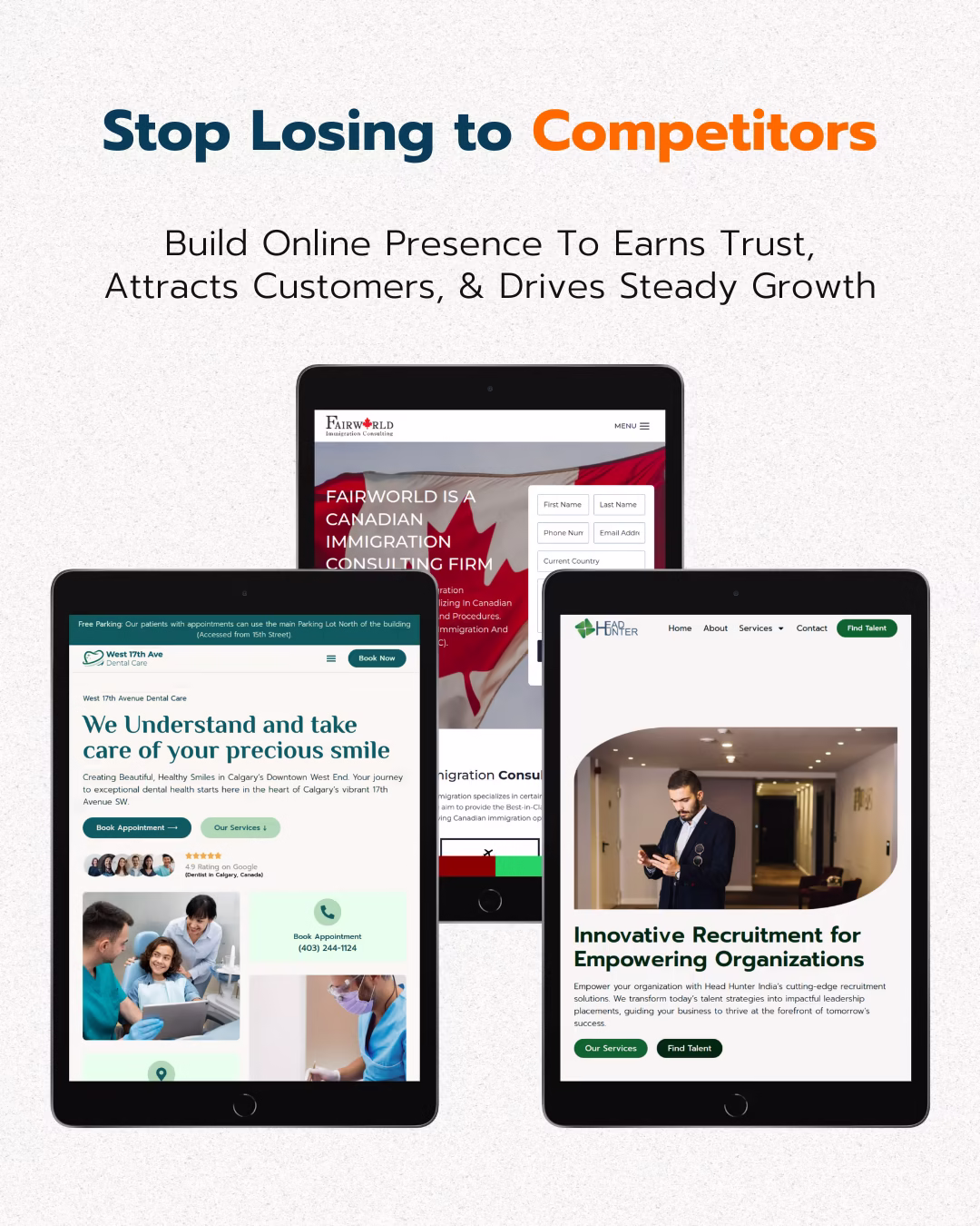
Many businesses invest heavily in driving traffic to their websites, only to see visitors leave without taking action. This happens because common website mistakes hinder the conversion process. Addressing these issues can significantly improve your site’s performance and revenue.
This guide explores seven top website mistakes that kill conversions. We will provide actionable strategies, real-world examples, and data-driven insights to help you identify and fix these problems, turning more visitors into customers.
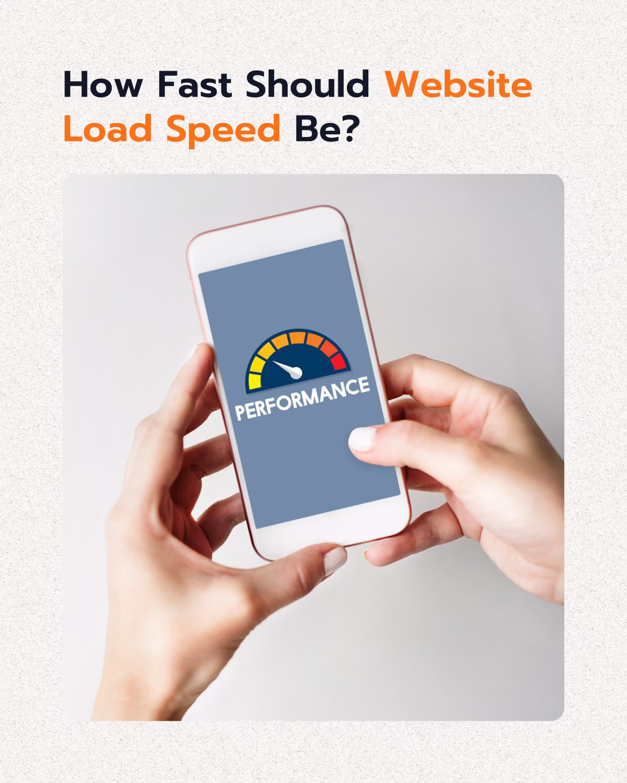
Website Speed Slow Loading Times
Website speed is not just a convenience; it is a critical factor for conversion. Users expect fast-loading pages, and any delay can lead to immediate abandonment. Slow sites directly affect your bottom line by increasing bounce rates and reducing engagement.
Research shows a strong correlation between page load time and conversion rates. Sites loading in 1 second can have conversion rates up to 2.5 to 5 times higher than those loading in 5 to 10 seconds. Currently, 86% of pages load in under 5 seconds, but even minor delays can be costly. For example, Cloudflare reports that increasing page load time from 2.4 to over 5.7 seconds causes a 68% drop in conversion rates, highlighting the need for speed optimization.

What are the primary causes of slow loading times? Large image files, unoptimized code, excessive redirects, and inefficient server responses often contribute to slow performance. Each of these elements adds to the overall load time, pushing visitors away before they can even see your content.
Fixing slow loading times involves a multi-faceted approach. Technical optimizations like image compression, code minification, and leveraging browser caching are essential. These strategies not only improve user experience but also contribute to better search engine rankings. Brands like Apple prioritize fast loading times to maintain high conversion rates, demonstrating the impact of speed on business success.
How to Improve Website Speed
- Compress Images: Large image files are a common culprit. Use tools to compress images without sacrificing quality. This reduces file size, allowing pages to load faster.
- Minify Code: Remove unnecessary characters from HTML, CSS, and JavaScript files. Minification reduces file size, speeding up download times for browsers.
- Implement Caching: Browser caching stores parts of your website on a user’s device. This means repeat visitors experience faster load times as fewer elements need to be downloaded.
- Reduce Redirects: Each redirect adds a delay. Minimize the number of redirects to ensure a more direct path to your content.
Impact of Site Speed on Conversions
| Load Time | Conversion Rate Impact | Supporting Data |
|---|---|---|
| 1 Second | 2.5x to 5x higher conversions | Plerdy |
| 2.4 to 5.7 Seconds | 68% drop in conversion rates | Cloudflare (via Plerdy) |
| 5 Seconds | Significant drop-off in user engagement | Plerdy |
Website Mistakes Poor User Experience (UX)
A confusing website experience is a top reason users bounce. Poor UX can manifest in many ways, from difficult navigation to unclear calls to action. When visitors struggle to find what they need or understand how to proceed, they leave, resulting in lost conversion opportunities.
The average website conversion rate is about 2.35%, but high bounce rates, typically ranging from 26% to 70%, indicate significant missed opportunities. These bounces often stem from frustrating user experiences. Even subtle navigation difficulties or unclear pricing can cause users to exit a site quickly.

Mobile conversion rates are particularly sensitive to UX. Mobile devices convert at about 1.53%, significantly lower than desktop at 4.14%. This disparity highlights that a poor mobile experience is a key conversion killer. Websites must be responsive and provide an intuitive experience across all devices.
To fix poor UX, simplify navigation, ensure content clarity, and make conversion actions obvious. Test your UX by having unbiased users review the site for confusion. This feedback can reveal pain points you might overlook, helping you create a more user-friendly interface.
Key Elements of Good UX
- Intuitive Navigation: Users should easily find information. Use clear menus, logical categories, and a consistent layout.
- Responsive Design: The website must adapt to different screen sizes. This ensures a consistent experience on desktops, tablets, and smartphones.
- Clear Visual Hierarchy: Guide users’ eyes to important elements. Use size, color, and placement to highlight key information and calls to action.
- Accessibility: Design for all users, including those with disabilities. This broadens your audience and improves overall usability.
Common UX Mistakes and Solutions
- Overwhelming Layouts: Too much information or too many options can confuse users. Simplify the design, focusing on essential elements.
- Inconsistent Design: Varying fonts, colors, or button styles across pages create a disjointed experience. Maintain a consistent visual identity.
- Hidden CTAs: If users cannot easily find what you want them to do, they will leave. Make calls to action prominent and clear.
- Slow Interactions: Delays in form submissions or page transitions frustrate users. Optimize backend processes for quick responses.
Unclear Website Copy
Your website copy is your digital salesperson. If it is unclear, uses excessive jargon, or fails to communicate value, it will not convert visitors. Many websites make the mistake of focusing on features instead of benefits, or using language that alienates their target audience.
A virtual assistant’s homepage headline changed from “Empowering Entrepreneurs Through Comprehensive Administrative Solutions” to “I handle your admin tasks so you can focus on what you do best: growing your business.” This simple change doubled her inquiry rate in one month. This case study demonstrates how clear, benefit-focused copy directly impacts conversion rates.
Effective copy speaks directly to the visitor’s needs and pain points. It explains how your product or service solves their problems, rather than just listing what it does. Using simple, direct language helps visitors quickly grasp your offering and its value.
To fix unclear copy, review your content from a fresh perspective. Ask yourself: Is this easy to understand? Does it clearly state the benefit? Would a first-time visitor immediately grasp what we offer? Consider getting external feedback to identify areas where your messaging might be confusing.
Principles of Effective Website Copy
- Clarity: Use simple, direct language. Avoid jargon or overly complex sentences.
- Benefit-Oriented: Focus on what your product or service does for the customer, not just what it is.
- Conciseness: Get straight to the point. Users scan, so make every word count.
- Call to Action Integration: Ensure your copy naturally leads to the desired action.
How to Write Conversion-Focused Copy
- Understand Your Audience: Know their pain points, desires, and language.
- Craft Compelling Headlines: Capture attention and convey value immediately.
- Use Active Voice: Makes your copy more direct and engaging.
- Break Up Text: Use short paragraphs, bullet points, and subheadings to improve readability.
- Test and Iterate: A/B test different versions of your copy to see what resonates best with your audience.
Typography Issues
Typography might seem like a minor detail, but it significantly affects readability and user experience. Fancy or overly large fonts can reduce readability and distract from key messages. When text is hard to read, users quickly become frustrated and leave, hindering conversions.
The goal of website typography is to facilitate reading, not to impress with elaborate designs. Err on the side of clean, simple fonts that prioritize legibility on all devices. This ensures that your message is conveyed effectively, regardless of how a user accesses your site.
Beyond font choice, other typography elements like line height, letter spacing, and paragraph width play a role. Poorly chosen settings can make even a good font difficult to read. For instance, long lines of text without sufficient line height can strain the eyes and discourage reading.
Removing obstructive elements, such as rotating “SALE” signs or flashing banners, improves product browsing ease and conversion potential. Focus on creating a visually calm and organized environment where text is easy to consume. This allows visitors to focus on your content and calls to action.
Common Typography Mistakes
- Unreadable Fonts: Using decorative or overly thin fonts that are hard to decipher.
- Insufficient Contrast: Text color too similar to background color, making it difficult to read.
- Incorrect Font Size: Text that is too small or too large, disrupting the reading flow.
- Poor Line Spacing (Leading): Too little or too much space between lines, affecting readability.
Best Practices for Website Typography
- Choose Legible Fonts: Opt for sans-serif fonts for body text and use serif fonts sparingly for headings if desired.
- Ensure Good Contrast: Use dark text on a light background or vice versa for optimal readability.
- Optimize Font Size: Aim for 16px or larger for body text on desktop, adjusting for mobile.
- Set Appropriate Line Height: Generally, 1.5 times the font size improves readability.
- Limit Font Variety: Use no more than two or three different fonts on a single page to maintain visual consistency.
Lack of Clear Direction and CTAs
Without clear direction, visitors do not know what to do next. This absence of guidance is a significant conversion killer. If your website lacks prominent and singular calls to action (CTAs), users will likely become confused and leave without converting.
If you are Local Business Owner check this post for Local Growth Blueprint
Every page on your website should have a purpose, and that purpose should be communicated through a clear CTA. For example, “Buy Now,” “Get a Free Quote,” or “Sign Up Today” are direct commands that guide users. Multiple or vague CTAs dilute user focus, making it harder for them to decide what step to take.

Explaining the benefits clearly alongside your CTA motivates action. Users are more likely to click if they understand what they gain. For example, instead of just “Download,” try “Download Your Free Guide to Boost Conversions.”
Top advertisers achieve 5.31%+ conversion rates, partly by using clear, focused CTAs. Websites with high conversion rates consistently guide their visitors through a logical path. Review your pages to ensure each has a primary, unmistakable action you want users to take.
Characteristics of Effective CTAs
- Action-Oriented Language: Use strong verbs that tell users what to do.
- Prominent Placement: Make CTAs easy to find, often above the fold or at logical points in the content.
- Visual Distinction: Use contrasting colors, larger fonts, or button styles to make CTAs stand out.
- Benefit-Driven: Briefly explain what the user gains by clicking.
Strategies for Optimizing CTAs
- One Primary CTA Per Page: Focus user attention on a single, most important action.
- Test CTA Text and Design: A/B test different wordings, colors, and sizes to find what performs best.
- Create Urgency or Scarcity (when appropriate): Phrases like “Limited Time Offer” or “Only 3 Left” can motivate clicks.
- Ensure Mobile Responsiveness: CTAs must be easily tappable and visible on smaller screens.
Keyword Disconnect
When visitors arrive at your site via a search engine, they have a specific intent, often expressed through keywords. If the landing page does not immediately reflect that search term or topic, visitors experience a “keyword disconnect.” This mismatch quickly erodes trust and leads to high bounce rates, killing conversions.
Aligning landing page content with visitor search intent is crucial for improving relevance and conversion. For example, if a user searches for “best noise-canceling headphones” and lands on a generic electronics page, they will likely leave. The page should immediately present noise-canceling headphones, ideally with reviews or comparisons.

This issue extends beyond organic search to paid advertising. If your ad promises one thing and your landing page delivers another, you are wasting ad spend and frustrating potential customers. Consistency between ad copy and landing page content is vital for conversion success.
To fix keyword disconnect, perform thorough keyword research to understand user intent. Then, ensure your landing pages are specifically tailored to those keywords and the implied user needs. This means using the keywords naturally in headings, body copy, and meta descriptions, and providing the exact information users expect.
Why Keyword Disconnect Kills Conversions
- Increased Bounce Rate: Users leave quickly when content does not match their expectations.
- Reduced Trust: A mismatch suggests the website is not relevant or trustworthy.
- Poor User Experience: Visitors feel misled, leading to frustration.
- Wasted Ad Spend: If you pay for clicks that do not convert due to disconnect, your ROI suffers.
How to Ensure Keyword Alignment
- Map Keywords to Pages: Assign specific keywords or keyword groups to relevant landing pages.
- Optimize Landing Page Content: Ensure headings, subheadings, and body text directly address the keywords and user intent.
- Review Meta Descriptions: Make sure your meta descriptions accurately reflect page content and search intent.
- A/B Test Landing Pages: Experiment with different content and layouts to see which best resonates with specific keyword searches.
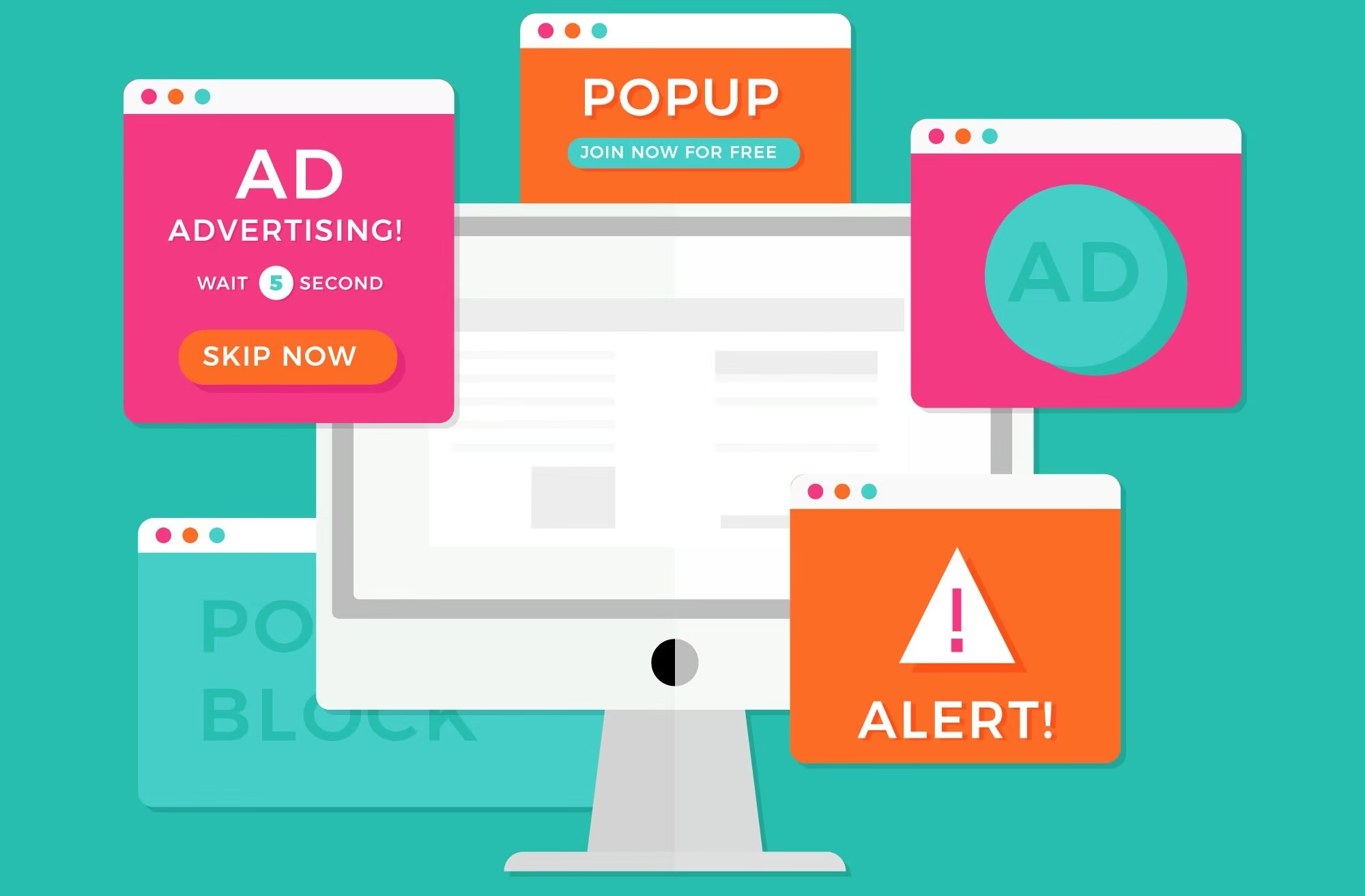
Overcomplicated Design or Too Many CTAs
An overcrowded website design or an excessive number of calls to action (CTAs) can overwhelm users. When faced with too many choices or a cluttered interface, visitors often experience decision paralysis and leave without taking any action. This complexity directly hinders conversion rates.
The principle of simplicity is paramount in web design. Streamlining your design to focus on a single, clear conversion goal per page helps guide users effectively. If a page’s primary purpose is to get a user to sign up for a newsletter, all elements should support that goal, not distract from it.

Consider the cognitive load on your visitors. Every additional element, image, or CTA requires mental processing. Reducing this load makes it easier for users to understand your message and take the desired action. This is particularly important on mobile devices where screen real estate is limited.
To fix an overcomplicated design, conduct a content audit. Remove unnecessary elements, consolidate information, and prioritize your CTAs. Ask yourself: “What is the single most important action I want a user to take on this page?” Then, design around that answer.
Signs of an Overcomplicated Design
- Excessive Pop-ups: Too many interruptions can annoy users and lead to abandonment.
- Cluttered Layouts: Pages with too much text, too many images, or disorganized elements.
- Multiple Conflicting CTAs: Offering “Buy Now,” “Learn More,” “Sign Up,” and “Contact Us” all with equal prominence on one page.
- Unnecessary Animations or Graphics: Elements that distract from the core message or slow down page load.
Strategies for Simplifying Design and CTAs
- Prioritize One Primary CTA: Each page should have a clear, dominant call to action. Secondary CTAs should be less prominent.
- Use White Space Effectively: Give elements room to breathe. White space improves readability and visual hierarchy.
- Remove Distracting Elements: Eliminate anything that does not contribute to the page’s main conversion goal.
- Conduct User Testing: Observe users interacting with your site to identify areas of confusion or frustration caused by design complexity.
Frequently Asked Questions
How do I identify if my website has slow loading times?
You can identify slow loading times using tools like Google PageSpeed Insights or GTmetrix. These tools provide detailed reports on your site’s performance and suggest specific improvements. Regularly monitoring these metrics helps catch issues early.
What are the main indicators of poor user experience (UX)?
High bounce rates, low time on page, and incomplete conversion funnels are key indicators of poor UX. User feedback, heatmaps, and session recordings can also reveal navigation difficulties or confusing layouts.
Why should I prioritize clear website copy over creative or jargon-filled text?
Clear website copy directly communicates value and builds trust, leading to higher conversions. Jargon or overly creative text can confuse visitors, making them question your offering and ultimately leave your site.
When should I use different font styles on my website?
Use different font styles sparingly, typically one for headings and one for body text. This creates visual hierarchy without sacrificing readability. Avoid more than two or three distinct fonts to maintain a clean, professional look.
How can I make my calls to action (CTAs) more effective?
Make CTAs prominent with contrasting colors and clear, action-oriented text. Ensure they are placed strategically where users expect to take the next step. A/B testing different CTA designs and wording can significantly improve their effectiveness.
What is keyword disconnect and how does it impact my website?
Keyword disconnect occurs when a user searches for a term but lands on a page that does not directly address that query. This leads to high bounce rates, reduced trust, and wasted traffic, as users quickly leave when their expectations are not met.
How do I simplify an overcomplicated website design?
Simplify design by removing unnecessary elements, prioritizing content, and using ample white space. Focus each page on a single, clear conversion goal. Conduct user testing to identify and eliminate elements that cause confusion or distraction.
What is the average website conversion rate I should aim for?
The average website conversion rate is around 2.35% to 3.68%, depending on the industry. Top performers can achieve 5.31%+ and elite websites can exceed 11% conversion. Your goal should be continuous improvement, aiming to surpass industry averages.
How much should I invest in Conversion Rate Optimization (CRO)?
Companies often spend only $1 on CRO for every $92 spent on customer acquisition. Top organizations allocate at least 5% of their budget to CRO, which correlates with higher conversion success. Increasing CRO investment can yield significant returns.
Can AI help in fixing website conversion mistakes?
Yes, AI is increasingly used for improving testing and optimization. By 2025, around 30% of companies are expected to use AI for CRO, up from 5% in 2021. AI can analyze user behavior, predict trends, and suggest personalized content to boost conversions.
What role does mobile experience play in website conversions?
Mobile experience plays a critical role. Mobile devices convert at about 1.53%, significantly lower than desktop at 4.14%. A poor mobile experience is a major conversion killer, making responsive design and mobile-first optimization essential for all websites.
How can I avoid unexpected costs causing cart abandonment?
Most cart abandonment occurs due to unexpected high extra costs like shipping or taxes. To avoid this, be transparent about all costs early in the checkout process. Offering free shipping or clearly disclosing fees upfront can significantly reduce abandonment rates.
What is a good bounce rate for a website?
Bounce rates typically range from 26% to 70%. A good bounce rate depends on your industry and website type. Generally, lower bounce rates are better, indicating users find your content relevant and engaging. Aim to keep your bounce rate below 50%.
Conclusion
Addressing these seven top website mistakes is not just about making cosmetic changes; it is about fundamentally improving your site’s ability to convert visitors into customers. From optimizing load times and enhancing user experience to refining copy and streamlining design, each correction contributes to a more effective online presence. By focusing on these critical areas, businesses can significantly boost their conversion rates, leading to increased leads, sales, and overall growth.